Magic UI vs Shadcn: Comparing Best UI Libraries for React and Tailwind
The best React and Tailwind libraries to speed up development with sleek, customizable components. These libraries are perfect for building responsive and engaging web apps.

The best React and Tailwind libraries to speed up development with sleek, customizable components, enhancing user interface design. These libraries are perfect for building responsive and engaging web apps, significantly enhancing the user experience.
Building a sleek, responsive, and efficient UI has never been easier, thanks to the growing number of React and Tailwind CSS libraries available today. These libraries simplify the development process and bring a wealth of components and pre-designed elements to your fingertips. Let’s dive into some of the best options, including Tailus UI, Magic UI, and ShadCN UI.
Overview of UI Libraries
UI libraries are essential tools in modern web development, offering a collection of pre-built UI components that can be effortlessly integrated into web applications. These libraries provide a set of reusable elements, such as buttons, forms, and navigation bars, which can be customized to meet the specific needs of any project. By leveraging these pre-designed components, developers can significantly reduce the time and effort required to build applications from scratch.
One of the primary benefits of using UI libraries is the consistency they bring to the design and layout of web applications. With a standardized set of UI components, developers can ensure a cohesive look and feel across different parts of their application, enhancing the overall user experience. Additionally, these libraries are designed with flexibility in mind, allowing for easy customization to align with a project’s unique branding and design requirements.
UI libraries like Magic UI and ShadCN UI are particularly valuable for their ability to streamline the development process. They offer a wide range of customizable components that can be tailored to fit any design language, making them indispensable for creating visually appealing and user-friendly interfaces. By incorporating these libraries into your development workflow, you can achieve a polished and professional look for your web applications while benefiting from the efficiency and scalability they provide.
Introduction to UI Components
UI components are the fundamental building blocks of a user interface, designed to create reusable and modular pieces of code that can be seamlessly integrated into web applications. These components can range from simple elements like buttons and forms to more complex structures such as navigation bars and dashboards. The beauty of UI components lies in their flexibility and customizability, allowing developers to tailor their appearance and behavior to meet the specific needs of a project. These components can be integrated into a cohesive design system, ensuring consistency across the application.
In the realm of web development, UI components are indispensable for crafting visually appealing and user-friendly interfaces. By leveraging pre-built UI components, developers can significantly reduce the time and effort required to build applications, while also ensuring consistency and scalability. This approach not only streamlines the development process but also enhances the overall user experience.
Moreover, UI components can be easily shared and reused across different projects, making them a valuable asset for any development team. Libraries like ShadCN UI, Magic UI, and Tailwind CSS offer a plethora of pre-built components that can be effortlessly customized and integrated into web applications. For instance, ShadCN UI provides a variety of customizable components, including buttons, forms, and navigation bars, enabling developers to create visually appealing and user-friendly interfaces with ease.
By incorporating these UI component libraries into your development workflow, you can achieve a polished and professional look for your web applications, while also benefiting from the efficiency and scalability that these tools provide.
Tailus UI with Tailwind CSS
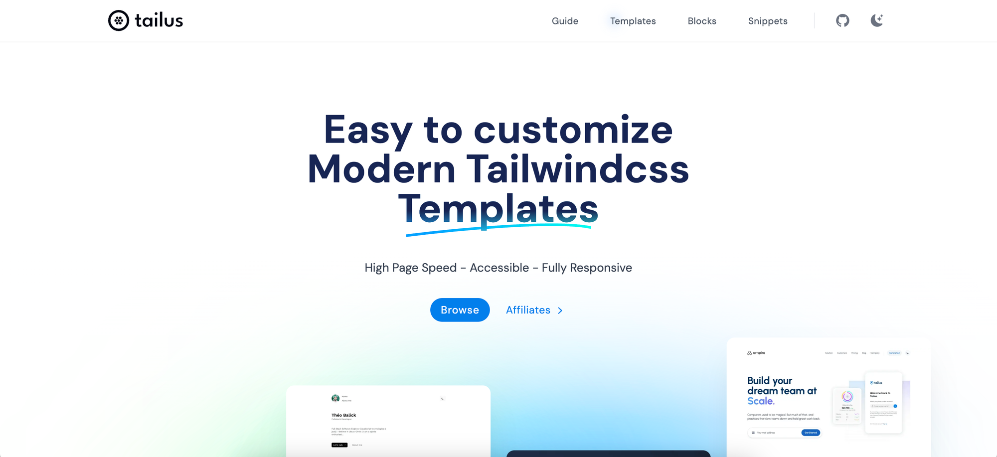
- Website: Tailus UI
- Overview: Tailus UI offers a stunning collection of pre-built, customizable components that are based on Tailwind CSS. It’s designed to help developers save time without compromising the aesthetics of their applications.
- Features:
- Wide Range of Components: Tailus UI includes everything from simple buttons and form controls to complex grids and cards. Tailus UI excels in creating a responsive design, ensuring that your application looks great on any device.
- Customization: Each component is easily customizable through Tailwind’s utility classes, giving you full control over the design.
- Accessibility: Components are built with accessibility in mind, ensuring a better experience for all users.
- Use Cases: Ideal for developers who want to create beautiful dashboards, landing pages, and web applications quickly.
Why Choose Tailus UI?Tailus UI shines in its focus on modern design patterns and seamless integration with Tailwind CSS. Its components are sleek and come with built-in animations and effects, making your web application feel polished and engaging.
Magic UI
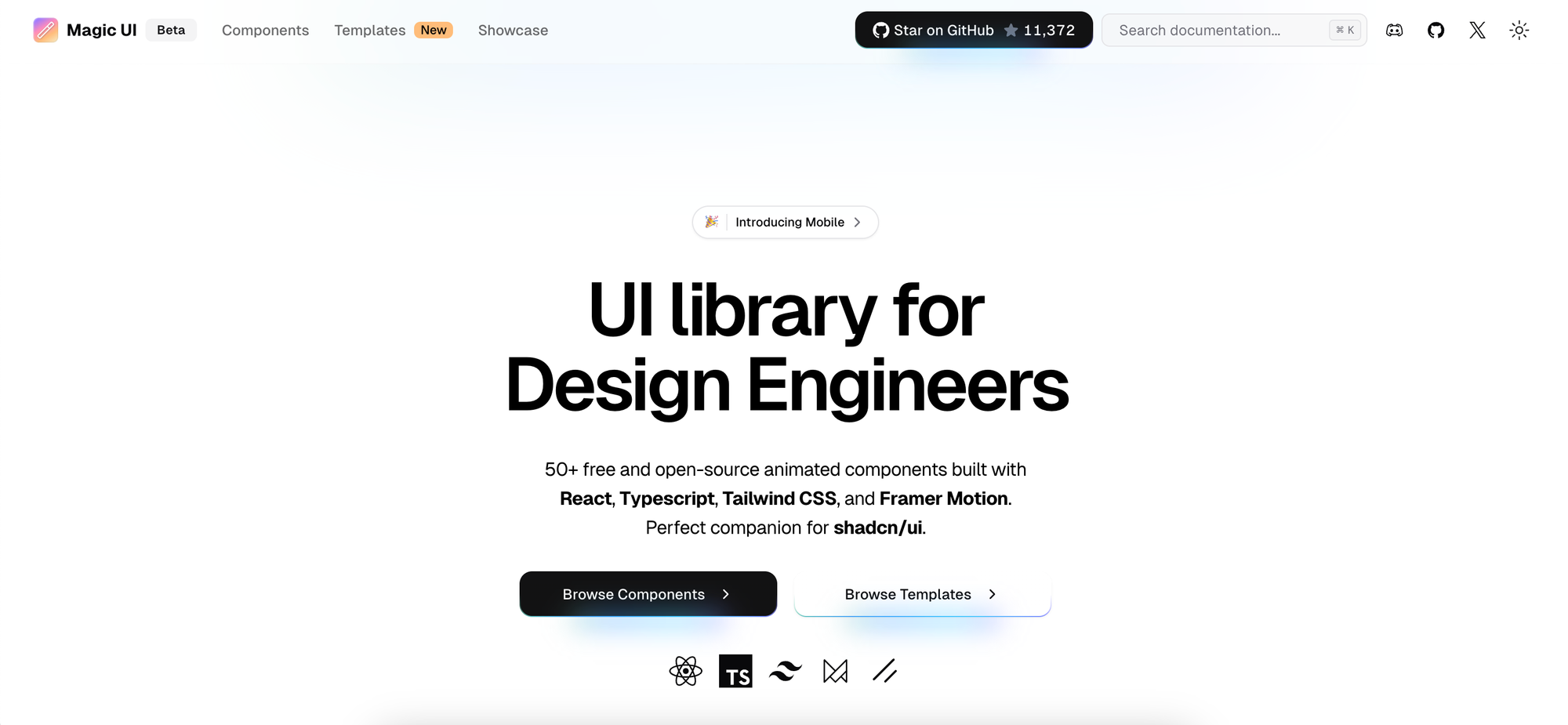
- Website: Magic UI
- Overview: Magic UI is a powerful and intuitive library that provides handcrafted components, offering flexibility and elegance for your user interface. It’s particularly useful for developers looking for creative design solutions.
- Features:
- Elegant Design: Each component is designed to be visually appealing and fluid.
- Animations and Transitions: Magic UI stands out by offering beautifully animated elements, making your app feel dynamic.
- Component Variety: From modals and sliders to form inputs and navigation bars, Magic UI provides an extensive set of components.
- Use Cases: This library is perfect for creating marketing websites, product pages, and applications that require a high level of visual interactivity.
Why Choose Magic UI? The focus on elegant transitions and animations makes Magic UI ideal for developers who want to give their apps a premium feel and enhance the user experience without having to build complex animations from scratch.
ShadCN UI Components
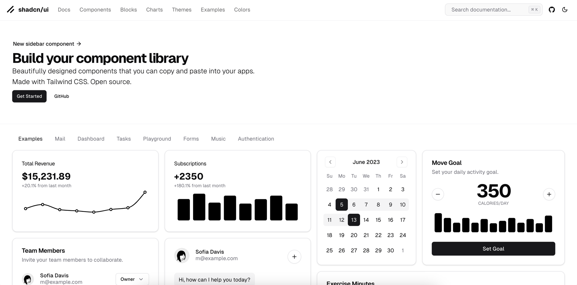
- Website: ShadCN UI
- Overview: ShadCN UI is a thoughtfully crafted component library built with Tailwind CSS and React. It offers a set of accessible, unstyled components, making it easier to align with your project’s branding. ShadCN UI can be seamlessly integrated into your existing design system, providing a cohesive and consistent look across your application.
- Features:
- Composable and Headless Components: The library provides unopinionated, flexible components, allowing you to style them as needed.
- Dark Mode Support: Out-of-the-box support for dark mode is available, a must-have feature for modern applications.
- Best Practices: The library is designed with accessibility and performance in mind, ensuring a great user experience.
- Use Cases: ShadCN UI is ideal for developers who need full control over their design but still want to leverage a pre-built foundation to speed up the development process.
Why Choose ShadCN UI?If you’re building a product with a unique design language, ShadCN UI provides the perfect balance between flexibility and functionality. You can create a fully custom look while benefiting from pre-built components and accessibility features.
Honorable Mentions: Most Trending React Components
While Tailus UI, Magic UI, and ShadCN UI are excellent choices, there are a few other libraries worth exploring:
- DaisyUI: A Tailwind CSS component library that focuses on simplicity and ease of use.
- Headless UI: Another popular option, especially for developers who want highly customizable, accessible, and headless components.
- Flowbite: Great for building web applications quickly, with a collection of responsive components that are easy to integrate.
How to Choose the Right Library for Your Project?
When choosing a React and Tailwind library for your frontend development, consider the following factors:
- Design Requirements: If you need a polished, animation-rich interface, Magic UI might be the way to go. For more control over styling, ShadCN UI would be ideal.
- Project Scope: If you’re building a quick prototype or an MVP, libraries like Tailus UI and DaisyUI can accelerate your development process.
- Customization Needs: If your project has a unique design language, choose a library that offers flexibility, like ShadCN UI or Headless UI.
Conclusion
React and Tailwind CSS libraries like Tailus UI, Magic UI, and ShadCN UI have revolutionized the way we approach frontend development. Whether you need visually appealing components, high customization, or seamless animation, these libraries have got you covered. By choosing the right one for your project, you can save time, improve developer productivity, and deliver a polished user experience.